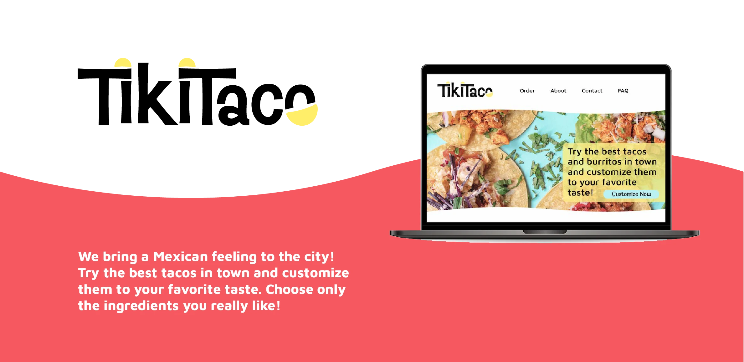
Tiki Taco
User Interface Design & Branding
Overview
Problem
The restaurant sells customizable tacos and burritos. They want to start a delivery service and need a website on which their customers can customize their order to their taste easily.
Insights
The users want to see at a first glance if the restaurant delivers to their area. They want to find out if the restaurant is open and see the price of the order at every stage of the ordering process. It should offer a good desktop and mobile experience and they want to be able to follow the order after it has been placed.
Process
User Personas
Michelle, 23, the traveler | Jakob, 26, the studious |
|
|
|
|
|
|
|
|
Needs
- Sell food online that will be delivered
- Provide a system for order customization
- Communicate what is offered and that it will be delivered fast
- Show delivery area and opening times on the start page
- Show prices of every product and additional cost next to every extra ingredient.
- Be responsive and easy to navigate on both desktop and mobile.
- A screen with a map where users can follow their order.
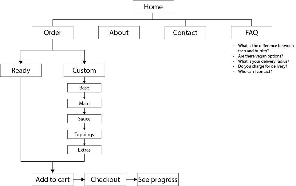
Requirements
Content:
- Opening times
- Prices at any stage of the ordering process
- Location and delivery radius
- Food menu
- Delivery speed
- About us, Contact, Images, FAQ
Functionality:
- Choose from a list of pre-defined food
- Or customize the meal
- Add items to shopping cart
- Check out
- See real-time order status on a map
Sitemap
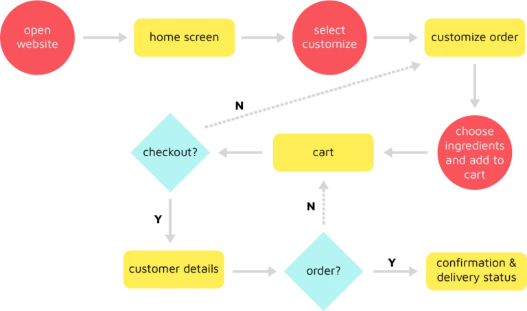
User Flow
Visual Design
Logo
Logo Variations
Color Palette

Typography

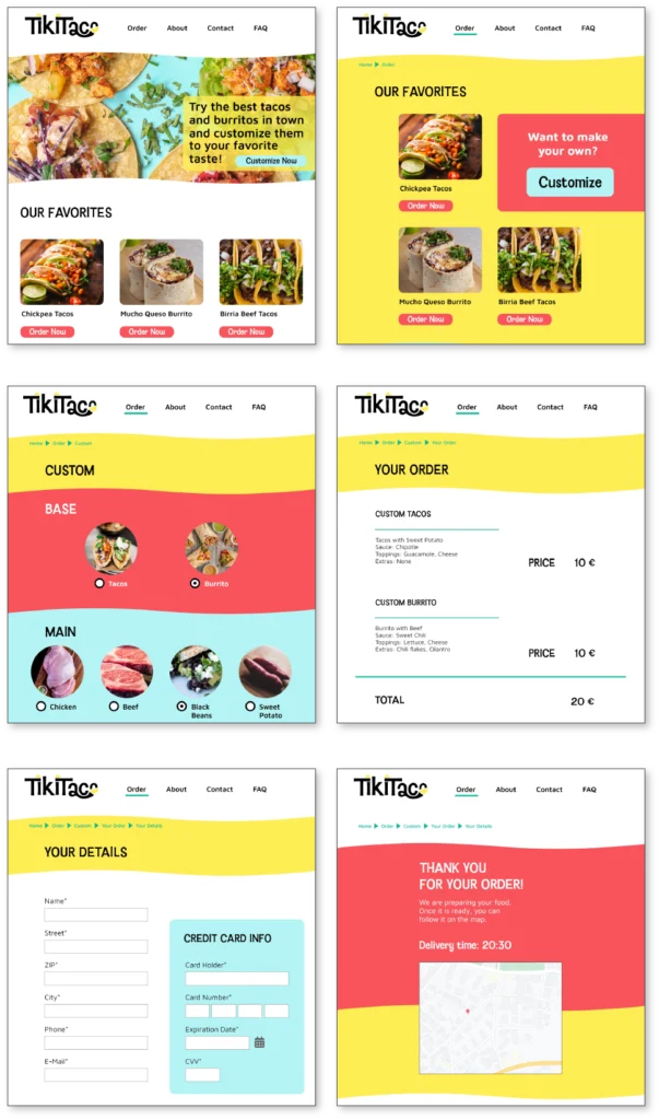
Wireframes & User Testing

The results of the usability study showed that the users needed to be able to go back at the stages of checkout and order.
I therefore added a button to go back to the previous page.
Prototyping
Next Steps
The plan is to include customization to more products within the menu range. In the future, they want to offer customizable drinks with different tastes and sweetness levels. Before, they want to test the existing feature if it is well accepted by their customers.
Lessons Learned
Convenience factor
I learned that people who want to order food, need much convenience to choose what they like. It has to go fast as they are hungry. The design has to be intuitive and it has to be possible to go back at each step in case they want to change their order. I added pictures to each ingredient so that users can easily select what they want.
Price not highest priority
One of the conditions was that the price should be visible at each step. The user tests showed that the price was not as important as expected because the users were prioritizing their favorite ingredients over the price.